This website design is a part of a larger research project that analyses how different people pronounce sounds differently based on the language they have grown up speaking. I interviewed twelve people whose native languages range from Hindi, English, Spanish, Bengali, Mandarin, Tamil, Turkish and Indonesian; essentially I compared and contrasted how tones and sounds vary across these languages.
A Guide To Tones
UI/UX
Motion
2020
Motion
2020
The Concept
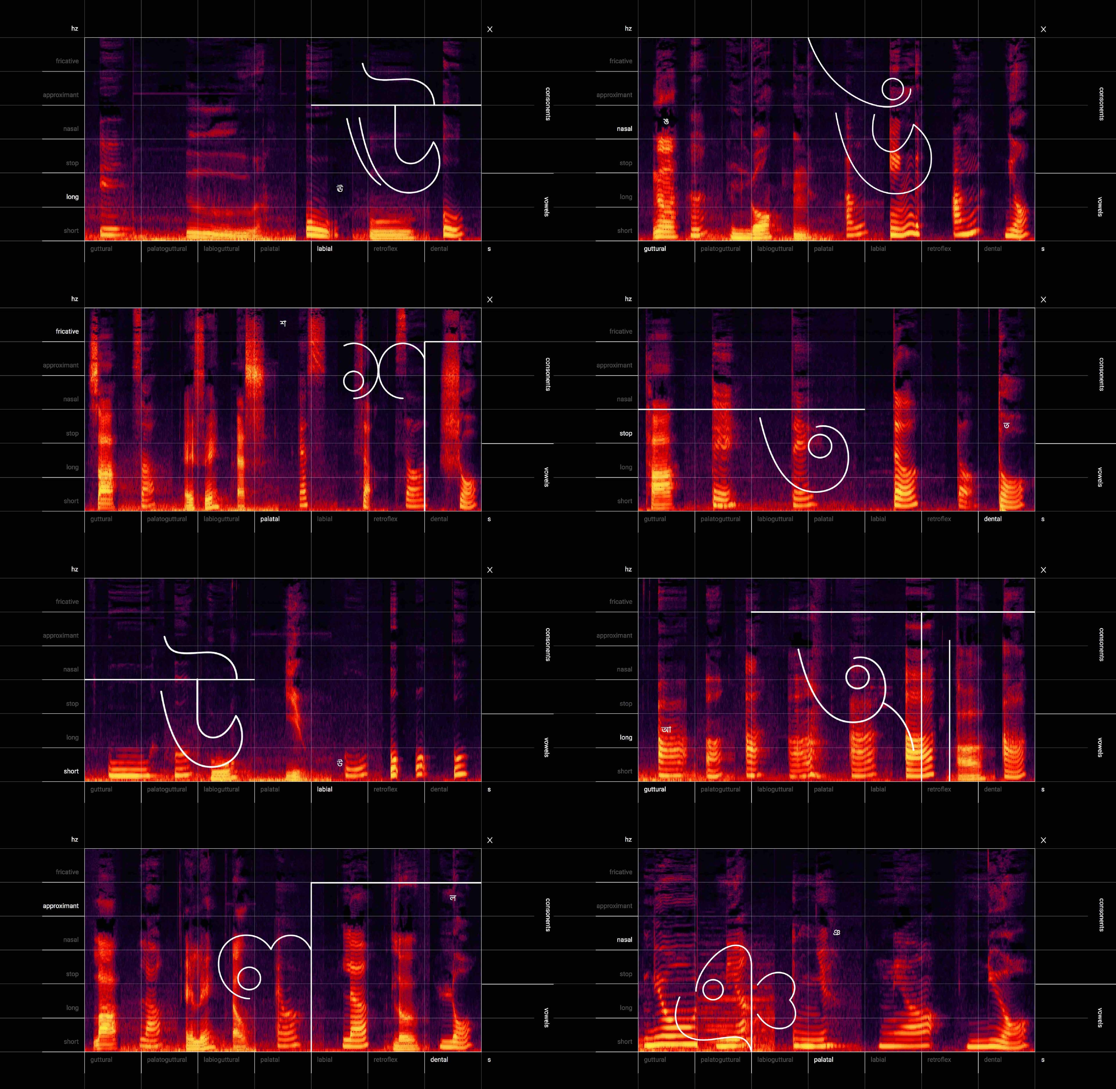
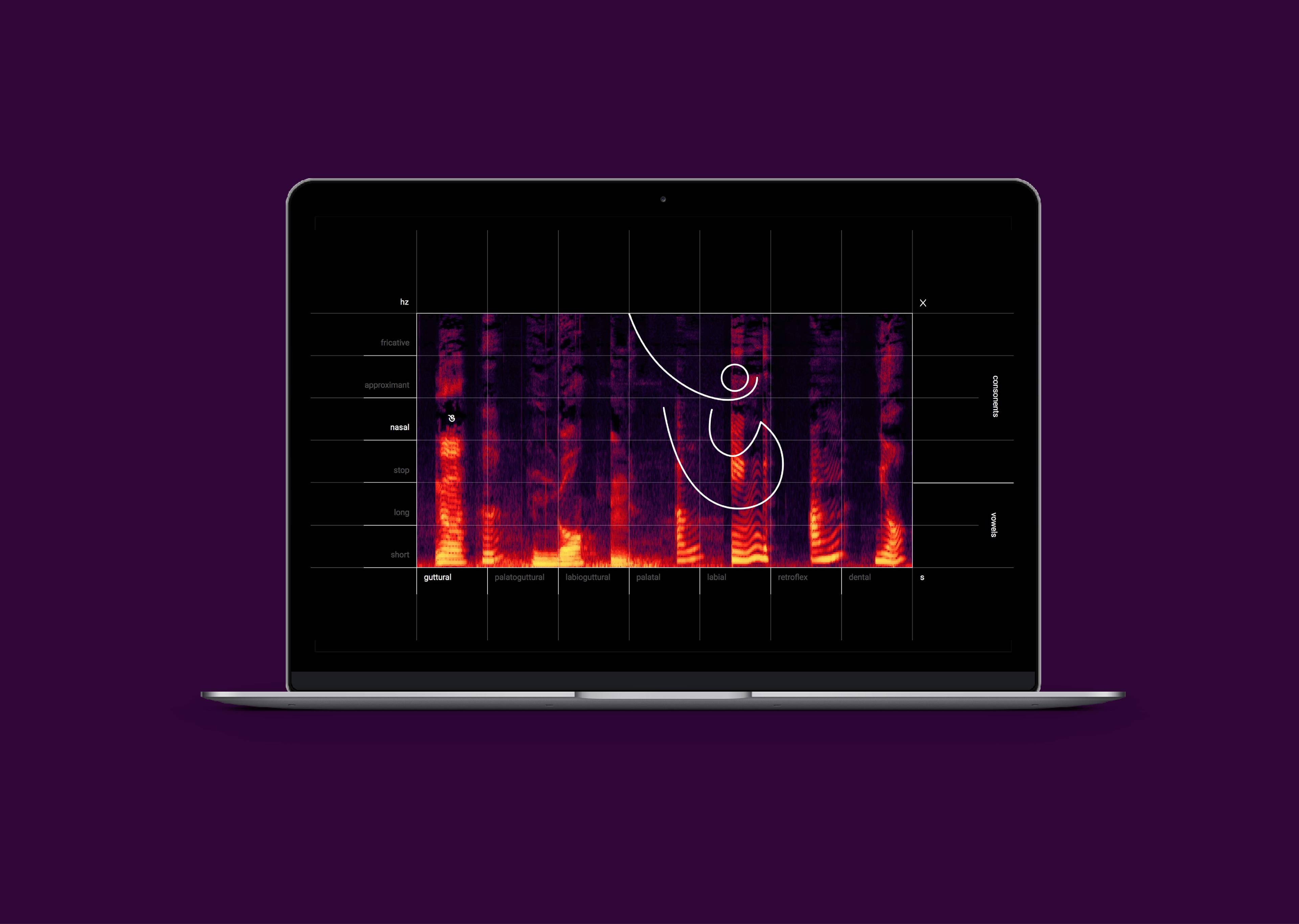
A conceptual take on cultural linguistics, this website presents a compilation of spectrograms (graphs measuring frequency of sound against time) of these recordings against a phonetic graph. The graph in itself categorizes letters of the Bengali alphabet into groups based on speech and breathing patterns.
The Website
On clicking a letter, the background displays a graph sequentially showing how different people have pronounced that very letter. And because not all languages contain all the sounds present in Bengali, the number of crests vary in the graphs.
The user can explore the different letters to see how speech patters visually vary and how some sounds/letters are present in significantly fewer languages. A working can be found on– http://aranihalder.github.io/thesis-medium2/
Design Elements
The website reimagines letters of the Bengali alphabet. The letters are reduced to strokes to create a more dynamic and rhythmic effect, in order to compelement the visuals behind it.

Select Screens